So, you have got yourself a great looking website. Bravo, this is great. However, don’t start believing the impossible in that people will magically land on your website, and start exploring things like the your head lines, calls to action, buttons etc automatically. This rarely happens in the real world. Visitors in general tend to have a peculiar mindset; they focus on unimportant things and miss the crucial ones on the website like the specific calls to action and sign up buttons you put up to increase your conversions. Instead, you should realize that just placing some crucial elements above the fold or below the fold is not going to solve the problem; you need to understand how people really see a website, otherwise you will always be struggling with conversions.
Top Left Sections Get All The Attention
Whenever a visitor lands on a website, he/she tends to first look at things at the top left section of the site. Indeed, a study reveals the following interesting facts –
- People decide whether they are going to stay on a web page or not in less than three seconds;
- If visitors decide to spend a few seconds on the page, it is the above the fold section they will give more attention to;
- People do not read a page, rather they scan the page to decide whether to stay on it or not.
While there can be some exceptions, usually the vast majority of visitors will focus on the top left section, which means that you should move the value propositions of your website to this area.

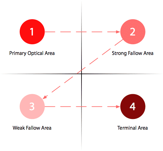
Still, things may change a bit when people look at text heavy content. In these case, our eyes move in a Z pattern. They start from the top left corner of the page to the top right section technically also known as “Strong Fallow Area”, then to the bottom right area that gets the least attention to then end in the “Terminal Area” – i.e. the bottom right area where we place the Call to Action button.
However, these are not hard and fast rules, but you should follow them as a good starting point.
Bigger Paragraphs for More Attention
People are more likely to read things that are in bold letters. This is one of the main reason why some websites use bold font in the first paragraph as it helps them draw the attention of the visitors to the topic of the page. However, this can backfire if you overdo it. Do not use bold fonts haphazardly as it could drive your visitors away. Use this trick when the first paragraph is small and has some sparks in it.
Focus on Left, Not Right
You won’t be surprise to find out that, usually, people read from the left to the right. As such, it is quite predictable that the left portion of the web page is most likely to enjoy more exposure compared to the right portion. Study reveals that users spend as much as 69% of their time viewing things featured on the left side of the page.

People Read in a F Pattern
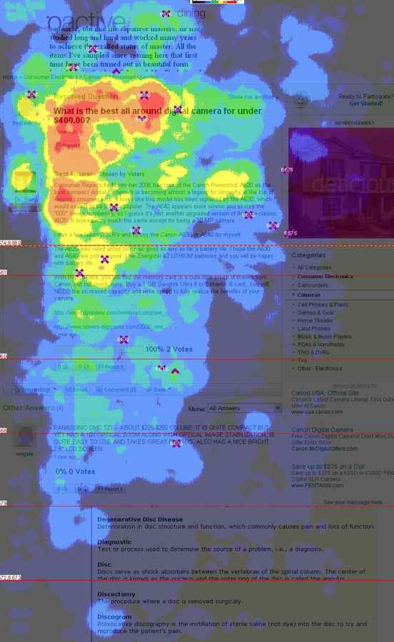
Though it might be hard to believe, the fact is most people do not read web content. Users actually scan the web pages. First they read the headline and, if they found it interesting, they go on reading the next few lines, but may start scanning things fast again before finally leaving the page. So, going by this, it makes sense to place the value proposition of our website at the top of the page. Also, it would be best to place the navigation panel on the left or on the top horizontal navigation bar.
People Love Large Images
Finally, the size and the quality of the images you use are two crucial factors that help in drawing the attention of the visitors. Hence, try not to sacrifice too much on these two fronts. Moreover, studies suggest that images of normal people will draw more attention than those of cheesy models, as the latter lacks empathy.
Leave a Reply